Discover the journey of resilience and innovation
Revolutionizing B2C gold buying experience
UI UX Design

About Ausper
Ausper is a pioneering B2C gold-tech platform dedicated to revolutionizing the gold-buying experience. Offering a range of services including discount cards, deals, and cashback for purchasing gold jewelry and products, Ausper stands out with its innovative product, Ausper LUV – India's first Visa-powered gift card specifically designed for gold purchases. Ausper prides itself on empowering users to easily access and navigate the world of gold buying and gifting.
Business challenge
Founded by two passionate marketing professionals with a love for gold, Ausper is driven by the mission to democratize gold gifting and buying. The vision is to establish Ausper as the go-to fintech platform, simplifying the process of purchasing gold and making it accessible to all. Targeting primarily women, who account for 90% of gold purchases in India, Ausper aims to empower them with enhanced options, better value, and informed choices, ultimately making gold buying a seamless and delightful experience.
My role
As the lead in user experience and visual design, I played a pivotal role in crafting the entire website experience for Ausper. Working closely with the co-founders and development team, my responsibilities encompassed conceptualizing and executing the user interface design while ensuring a seamless and intuitive user experience throughout the platform.
Problem statement
Ausper approached us with the challenge of designing a brand website that serves as a promotional and marketing platform, effectively conveying the essence of the brand and its products to the audience. The website needed to go beyond mere product showcasing and act as a medium for storytelling, engaging users with the brand narrative through compelling visuals. Additionally, Ausper aimed to cultivate a sense of community among its users, fostering interaction and engagement on the platform. Furthermore, the website was expected to provide a delightful gold gifting experience, enhancing the overall user experience and leaving a lasting impression on visitors.
Key learnings
1. Strategic Alignment for Audience Engagement: Collaborating with diverse stakeholders honed my communication skills and ensured alignment on project goals.
2. Persistence Pays Off: Enduring through 13 design iterations underscored the importance of patience and persistence in achieving excellence.
3. Resonating with Audience and Business Goals: Aligning with stakeholders' vision to position the brand and deliver customer delight, the website design successfully resonated with the target audience, emphasizing the importance of meeting user expectations and business objectives simultaneously.
4. Continuous Adaptation: Embracing a growth mindset and remaining adaptable allowed for iterative improvements, emphasizing the value of flexibility in complex projects.
5. Exploration of New Design Styles: The project introduced me to new styles of visual design, including 'Brutalism' and 'Neobrutalism', expanding my creative repertoire and enhancing my ability to experiment with diverse design approaches.
Constraints
1. Distinct Brand Identity: Despite being a fintech platform in the gold industry, the stakeholders expressed a clear desire to differentiate Ausper from traditional fintech and jewelry brands. This constraint required the design to steer away from typical fintech aesthetics and instead create a unique brand identity that resonated with the target audience.
2. Engaging Storytelling: The website was expected to not only showcase products and services but also tell an engaging story that encapsulated the brand's values and mission. This constraint necessitated a strategic approach to storytelling through the design elements, content, and user experience to effectively communicate the brand narrative.
3. Customer Delight: A primary objective of the project was to deliver a delightful user experience that exceeded customer expectations. This constraint guided the design decisions to prioritize user satisfaction, ease of use, and emotional connection with the brand, ensuring that every interaction with the website left a positive impression on the users.
Design intervention
The Stree-Dhan Story
Through intensive discovery sessions, we delved into Ausper's mission to empower Indian women by promoting gold as "stree dhan" – a symbol of natural wealth and financial security exclusively owned by women in their ecosystem. Drawing inspiration from this cultural significance, we crafted a narrative centered around the ubiquitous gold buyer, leveraging their emotional journey as a metaphor to capture the essence of Ausper's brand identity. Ausper sought a visually dramatic approach for their website, aiming to evoke raw emotions and resonate deeply with their target audience.
Process
The project unfolded through the following stages
Discovery
Understanding client objectives and user needs.
IA & site map
Mapping out the website structure and content hierarchy.
Design
Sketching out low-fidelity layouts, applying the design language, refining
Deliver
Handing over final design files to developers for website development.
Steps taken
1. Discovery & research
In the discovery phase, we engaged with stakeholders to gain insights into Ausper's objectives and target audience. One crucial revelation was the declining delight in the gold-buying experience, attributed to high prices and a lack of innovative experiences in the market. Conducting a comprehensive competitive analysis within the fintech domain provided valuable insights into industry trends and best practices. Through this research, we identified the need for Ausper's brand to stand out from traditional fintech and jewelry brands, setting the foundation for a unique design approach.

2. Architecture & mapping
Following the discovery and research stage, we transitioned into crafting the architecture and site map for Ausper's website. This stage is pivotal as it establishes the structural foundation of the platform, akin to designing the blueprint of a home. By defining the site map early on, we gained clarity on the overall structure and organization of the website, ensuring alignment with user expectations and mental models.
The site map served as a visual representation of the various content buckets and their hierarchical arrangement. Collaboratively, we delineated dynamic pages for offers and jeweler sections, recognizing the potential to leverage a Content Management System (CMS) for efficient content management. This approach enabled us to focus on curating compelling content rather than creating static pages, facilitating scalability and adaptability for future updates.
This phase of the project underscored the importance of clear communication and alignment from inception to execution. By documenting the site map and architectural decisions, we established a tangible reference point for the project's direction. This served as a definitive anchor, signaling readiness to progress into subsequent phases with confidence and clarity.

3. Wireframing
Building upon the foundation laid by the site map, we transitioned into the wireframing phase to delineate the layout and structure of Ausper's website. Wireframing serves as a bridge between conceptualizing the information architecture and defining the visual design elements, striking a balance between clarity and fidelity.
Global Navigation and Footer: We initiated the wireframing process by focusing on the global navigation, ensuring a logical and intuitive arrangement of navigation items. Following stakeholder feedback, we streamlined the footer to maintain a sleek and minimalist design, reflecting Ausper's brand aesthetic.
Homepage Design: Collaborating with a content writer, we structured the homepage content to engage users effectively. Together with stakeholders, we crafted a compelling narrative that introduces Ausper, conveys its friendly persona, showcases its offerings, and establishes trust by highlighting its partnerships with established brands.
Products Page: Recognizing the importance of showcasing Ausper's products, we dedicated a separate page to provide comprehensive information on their functionality and benefits. This decision enables users to understand the value proposition of each product and its potential impact on their lives.
Ausper LUV Experience: Central to the wireframing process was designing the Ausper LUV gold gifting experience. Our goal was to create a seamless and delightful journey for users, ensuring simplicity in navigation and instilling a sense of joy and satisfaction throughout the gifting process.
By strategically mapping out the layout and functionality of key website components, the wireframing phase laid the groundwork for the subsequent design iterations, fostering alignment with stakeholder expectations and user needs.

4. Visual design
In this pivotal phase of the project, we embarked on shaping the visual identity of Ausper's website. While it was undoubtedly exciting, we encountered some friction as certain design elements didn't align with the client's vision. Nonetheless, this phase provided valuable opportunities for refinement and collaboration. To kickstart the visual design process, I divided this phase into two key steps: Moodboarding and Applying the Visual Language.
1. Moodboarding: Moodboarding involved setting the mood and tone for the design, starting with the establishment of a mood statement – "User feels delighted when saving/investing/gifting with Ausper." From there, we derived emotional responses such as 'Celebration', 'Joy', 'Inclusivity', 'Togetherness', and 'Delight', which informed the overall style we aimed to achieve – warm, modern, minimalist, approachable, and edgy.

2. Applying the Visual Language: Once the mood and tone were established, we proceeded to apply the visual language across the design elements. This involved defining the communication style through visual elements such as videos, illustrations, and photos, ensuring alignment with Ausper's brand message. We then meticulously paired typography to enhance communication effectiveness, considering SEO, accessibility, and overall communication standpoint. Utilizing Pinterest as a primary resource, we curated a comprehensive moodboard of relevant styles, tones, and visual language references, serving as a source of inspiration and reference for the subsequent design iterations.


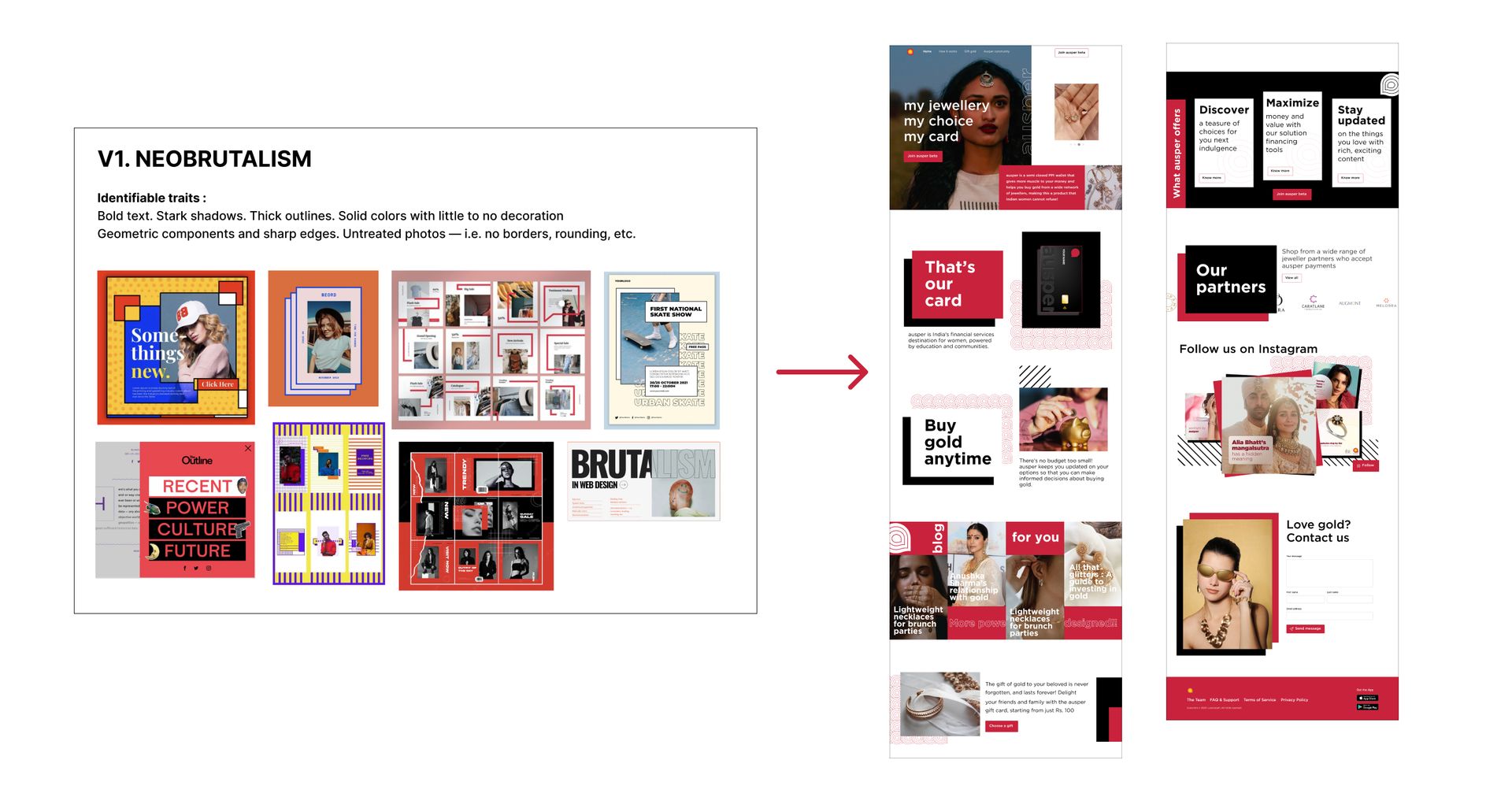
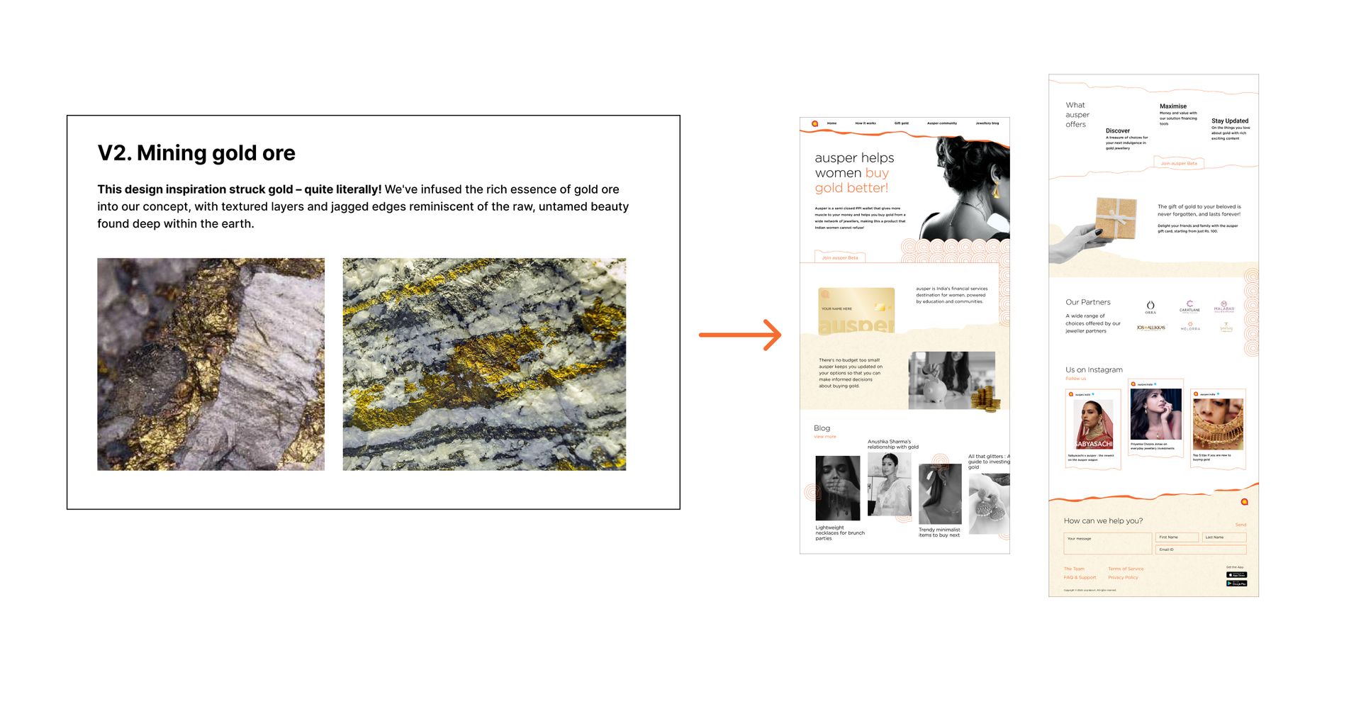
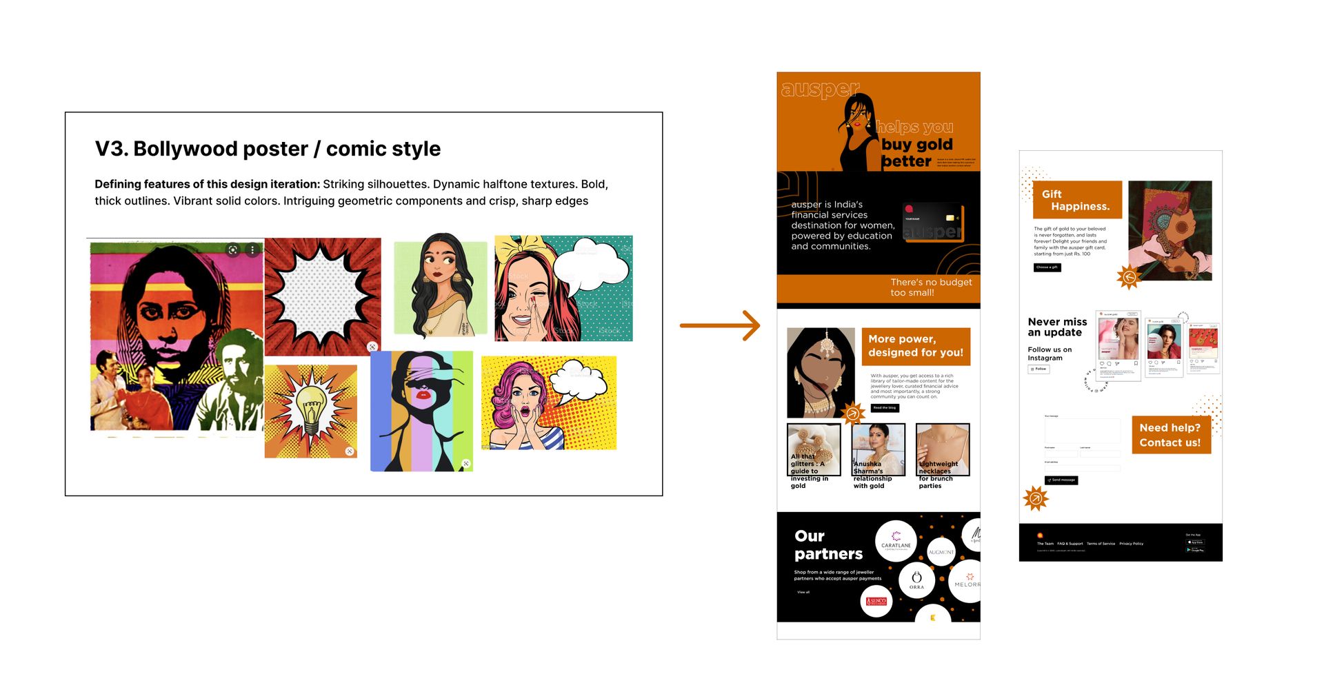
Different visual options
5. Iterative design refinement
After presenting initial design concepts to the client, we experienced a series of push and pull dynamics as we worked to articulate Ausper's core values through the visual design. Despite presenting multiple iterations, it became evident that the designs were not effectively communicating the essence of the brand. This stage of the process required resilience and a willingness to embrace vulnerability as a designer.
1. Principles Guiding Refinement: In response to the feedback and challenges encountered, we established a set of strict principles to guide the design refinement process. These principles emphasized the warmth, accessibility, and celebratory nature of the Ausper brand, steering away from traditional luxury connotations and positioning Ausper as a lifestyle brand with mass appeal.
2. Client Feedback and Iterations: Armed with a fresh mindset and a clear direction, we revisited the drawing board, incorporating feedback from the client and adhering to the established principles. The client provided specific guidelines, including preferences for flat design with a new age twist, large typography, and a decluttered aesthetic. These directives informed the design process and guided subsequent iterations.
3. Breakthrough: After 12 iterations, we finally arrived at a moment of triumph – a design that not only met but exceeded the client's expectations. With a flourish of creativity and a dash of persistence, we unveiled a design that captured the essence of Ausper's brand identity with unparalleled precision. The incorporation of brutalism and neobrutalism elements, coupled with flat design principles and the vibrant palette of sorbet colors, brought the vision to life in spectacular fashion. And with the introduction of watercolored textured silhouette illustrations, the design took on a whole new dimension, infusing a modern twist into the traditional concept of gold. It was a moment of sheer exhilaration and pride as we witnessed the culmination of our collective efforts – a design that not only resonated with the client's vision but also encapsulated the spirit of celebration and empowerment that defines the Ausper brand.
A glimpse of final outcome


Impact & result
While specific metrics were not gathered post-implementation, real-time feedback from users provided valuable insights into the impact of the design solution. One notable comment came from a friend who ordered gift gold from the website, expressing appreciation for the seamless and accessible gifting experience. This firsthand experience highlights the success of the design in enhancing user satisfaction and facilitating easy navigation through the website. Overall, the positive reception from users underscores the effectiveness of the design solution in achieving Ausper's objectives and delivering a delightful user experience.
Conclusion
In conclusion, the journey of designing Ausper's website was marked by challenges, perseverance, and ultimately, success. By adhering to strict principles, embracing feedback, and staying true to the brand's core values, we delivered a design solution that exceeded expectations and laid the foundation for Ausper's digital presence. As we look ahead, we remain committed to driving continued innovation and delivering exceptional experiences that propel our clients toward their goals and aspirations.